As a data scientist, it is very important to choose a proper method to viusalize the data. The use of different visualizaiton methods have different purposes and could reveal the data in different aspects. The good visualization could make the communication with the stakeholders more effectively. Here, I introduced two commonly used visualization methods in data science.
The first one is the histogram plot, see the following image as an example of the histogram of the house price in project 2:
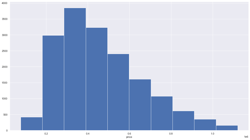
The histogram is a bar plot with each bar indicates the number of values belonging to a specific range of values. The histogram could tell us the distribution of all values, e.g., “symmetric”, “skewed left” or “right”, “unimodal”, “bimodal” or “multimodal”. The above figure indicates the price is skewed right. It also could tell us which value range have more data. Based on the histogram plot, we could know what’s the approximate distribution of the data, e.g., normal or not, and do subsequent data processing.
The second one is the boxplot, see the following image as an example of the boxplot of price for the houses with different number of bedrooms in project 2:
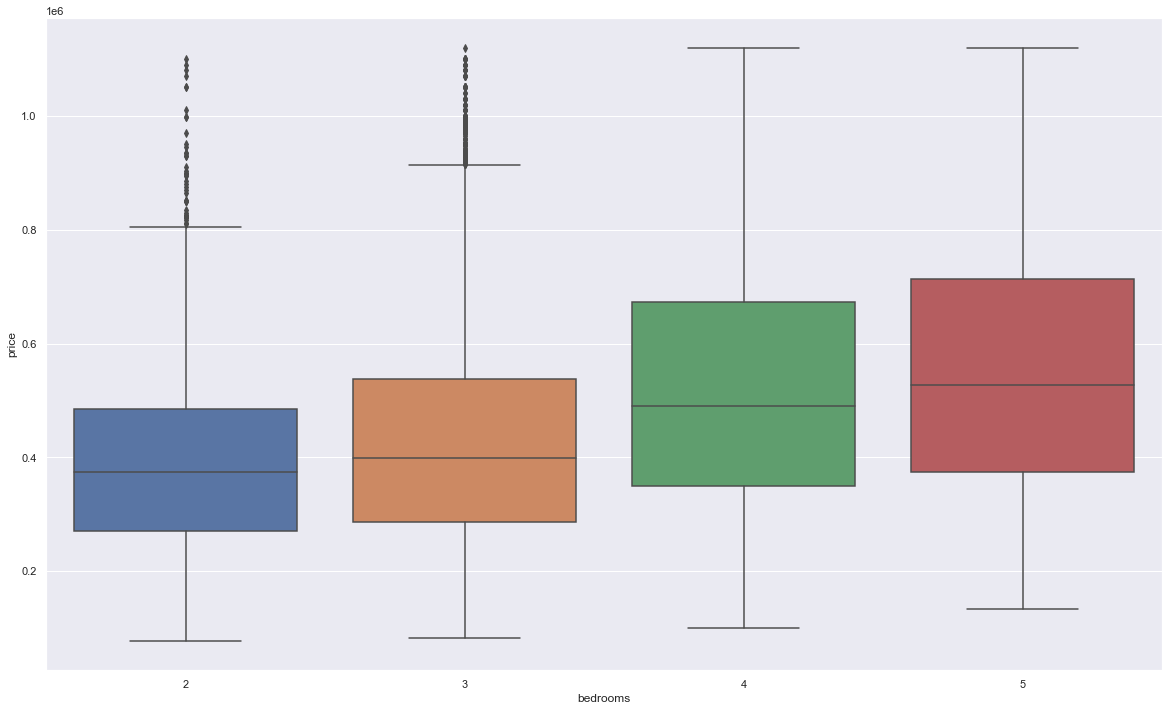
The boxplot is still a bar plot, which is often used to visualizaiton the values belong to different groups with each group as a bar, e.g., the price values of the house with different number of bedrooms. The boxplot directly viusalize several summary statistics, i.e., the minimum, the maximum, the sample median, the first (Q1) and third quartiles (Q3), as well as the outliers. Based on the interquartile range (IQR) as Q3-Q1, the minimun and maximun are defined as Q1-1.5 * IQR and Q3 + 1.5 * IQR, respectively. And the values beyond the range from the minimun to maximun are the outliers. Again, the boxplot can tell us the distribution of data, e.g., it is a normal distribution if Q1 and Q3 are symmetric with respect to the median.
Based on the characteristics of the data and the project goal, we should choose proper visualization methods for different types of data.